Friday, November 14, 2014

On Line and Generating Immediacy.

While sitting in Medieval Art History, we were presented with a slide of the Bayeux Tapestry. A massive two-hundred-some foot long chronicle of the Battle of Hastings, which saw the death of King Harold and marked the beginning of Norman occupancy and rulership of ancient England by William the Conqueror. While the purpose of the tapestry and reason for its creation is up for a decent amount of speculation, my professor sought to point out an interesting part of the style of the piece, that is the use of line to deliver a sense of movement. She then described the influence of this new Norman style of art and, rightfully so, made the comparison between it and modern day (western) comics.


Hearing that comparison and seeing the images it immediately makes sense and can probably be easily accepted at face value. However, the similarities don't end at face value and once you start digging deeper and looking into the more acute and esoteric visual queues between the tapestry and comics some really interesting connections arise

One particular connection between the two is the use of line in generating motion and immediacy.

In modern day comics we are rather spoiled as far as the styles and accepted visual tricks to convey speed. Everything from the eastern tradition of abstraction.


to the use of "speed lines"
Otomo, Katsuhiro. "Akira" 

and the (sadly) less commonly used exaggeration.

Moore, Tradd. "Ghost Rider." New York: Marvel Comics, 2014. Print.

However, at the root of it all is a one-thousand year image. Which through simple tricks and changes in line-work can convey a vast array of motion and actions
Marching Calvary
A Breaking Charge
Relenting Infantry

Harold Slain (and some poor sap getting mowed down)
In any case, the Bayeux Tapestry is an excellent example of sequential art and still reveals how to use line to convey motion without the use of abstraction or "tricks;" instead focusing on the raw object and how to depict them in order to to create a sense of immediacy and action.


Sunday, November 2, 2014

On Comic Layouts

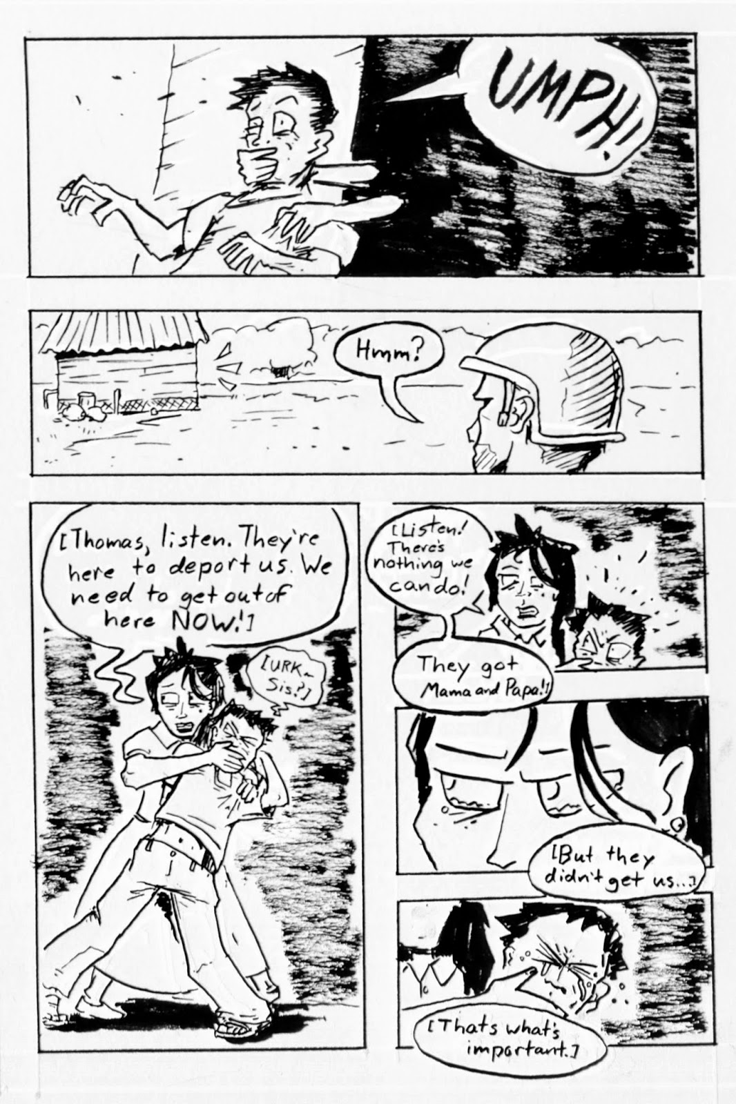
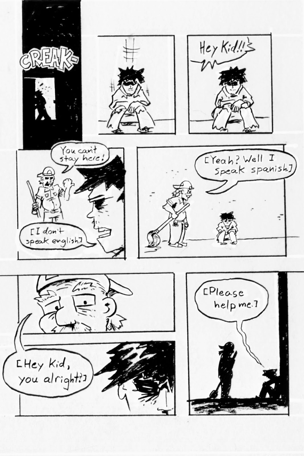
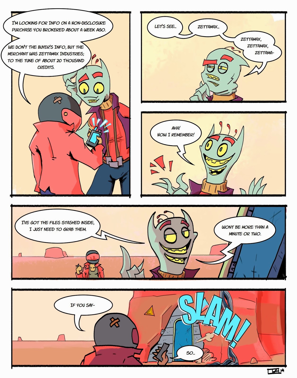
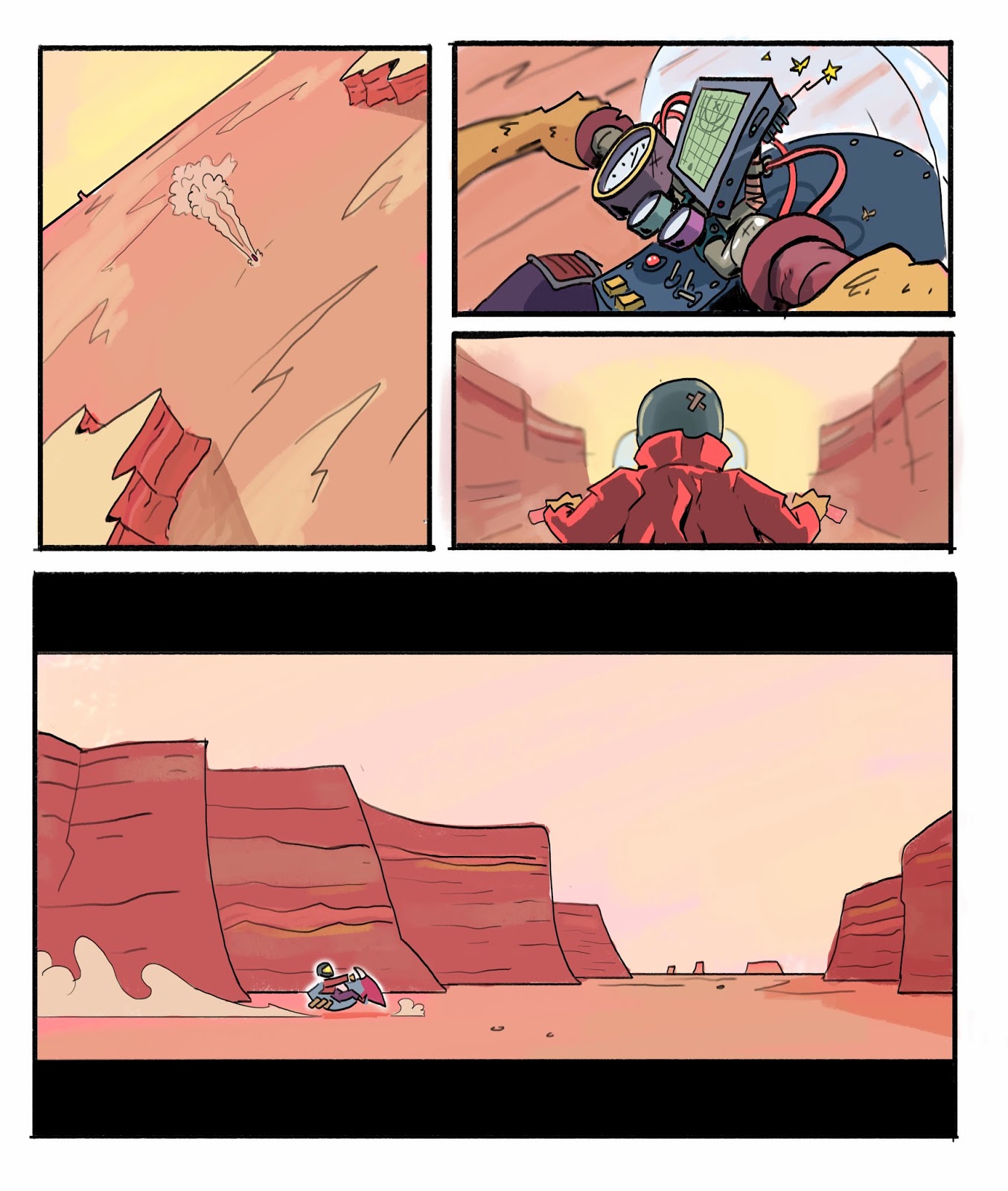
I'm about 3 hours deep into inking a page of comics. While working I decided that it was probably time to start actually thinking about my process as far as how the pages are laid out and how I make decisions in regards to composition and laying out panels.

1. The Media

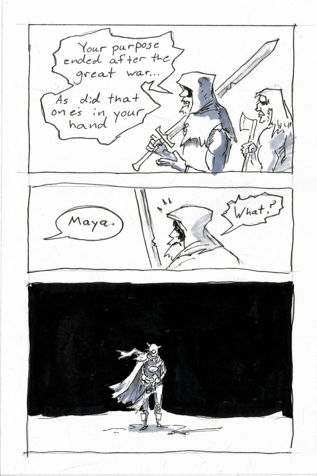
The funny thing about comics is that they function as compositions within compositions, in that each panel has to stand up on its own AND fit compositionally with the whole page. Because of this panel arrangement comes second to how the page is composed as a whole. With that said a majority of the thinking comes from crunching out thumbnails and small sketches of the page.

2. What Makes a Panel

A panel represents a single moment in time within part a scene. Much like directing a movie, what each one of these panels must further the readers understanding of either the action, character(s), or setting. That is not to say that comics function in the same manner that movies do, rather, they offer a good basis and example for composing scenes and panels.

3. Mood

How the panels and the page are presented play a large role in the mood of the piece. A quiet scene between two friends at a cafe for lunch would obviously be laid out differently then two super-heros fighting an airborne battle above manhattan. But it applies in more subtle respects as well. In the case of the cafe lunch, whether the scene is meant to be a quiet reflection or a tense measure of wits can sometimes entirely depend on what is shown and how it's shown without a change in the script or setting. This is something that is explored during the thumb-nailing and rough sketch stage.

4. Hierarchy

Once a mood and basic layout has been set, the next step is establishing a visual hierarchy. This deals with the whole "page and panel" set-up of the comic medium. Unless the intention is for each panel to have equal visual and compositional weight on the page the layout must be constructed in order to give a particular panel a greater presence on the page. The easiest way to do this is making that panel the largest. However, in order to avoid visual stagnation through repeating the same trick over and over again other techniques must be used such as placement of the panel, color/value changes, "breaking" the rules of the panel, changing of perspective, etc.

5. Drawing

After the thumbnails and rough sketch, the final drawing of the page can begin. The amount of time that it takes to "finish" a piece is usually directly affected by the time spent on the thumbnails and sketches i.e. the more time spent "realizing" the page, the less time it will take to actually put it down on paper. Adherence to changes made throughout the process as well any predetermined rules set by the comic (perspective, visual language) are critical; ignoring them means sacrificing any f the work previously done for the page. Additionally, and it may go without saying, a solid foundation in drawing and technical skill must be put to use.

Recommended Reading:
Scott McCloud, Understanding Comics
Scott McCloud, Making Comics


Friday, October 17, 2014

The More Steps the Better

I recently completed a page of comics that I was incredibly proud of and it was at that point that I decided to really look at how I arrived at this end. I have to thank my colleague Jake Peck in some small part for pointing out the importance of self-reflection when it comes to craft; he's written rather extensively on the subject.

However, my own "method" tends to be rather cut-and-dry as shown below.


Most of the actual "thinking" comes during the thumbnail (not shown) and drawing stage. Due to the fact that few of the actual penciled lines make it all the way to the ink stage, it allows me to loosen up and focus on creating a good gesture and establishing a visual hierarchy. Not to mention some of the comic book making rules I've picked up over the years (next blog post). After the pencils are scanned I touch them up and render them to completion on the computer where upon I print them in blue; the less I leave out of the final renderings the easier the inking process becomes. Finally the only stage that ends up seeing the light of day is the inks. Despite the seemingly gestural look of some of the lines they actually are all thought out previously to ensure that no mistakes are made during the final process.

Each step refines the final product bit-by-bit, so the more steps I throw down along the way the more refined and ultimately better product I make.

Friday, September 26, 2014

Gesture Drawings

Since my senior year of college I have had no anatomy classes. Granted this is to allow us to focus on client driven projects. Still, I could feel myself sinking back into old (bad) habits as far as drawing is concerned. However, thanks to the internet, my remedy is within my grasp!

There is this fantastic little website called pixel-lovely, it's basically just a random timed slideshow of high rez images specifically for artists to practice figure and gesture drawing. At this point since I'm too broke to pay for figure drawing sessions.

Anyway...

I love figure drawing and the practice is invaluable. Pixel-Lovely is a great discount option in the meantime and I recommend it to anyone interested!


Happy drawing!


Monday, August 11, 2014

Lettered pages

I'm up to twelve pages inked and colored, as well as the following six pages lettered. It's the first time I've lettered something using illustrator. I gotta admit: it's a lot easier.


Anyway, back to work.

Saturday, May 24, 2014

Automatic comics

The one thing that always intimidates me in regards to making art is color.

I'm happy with my line-work and drafting abilities, I'm comfortable with value and tone. Unfortunately my color is shaky at best and therefore intimidating to me.

In order to remedy this I've been going through a very strict regime of 6 to 9 hour workdays and at least one finished piece a day. Most of it's crap but occasionally something fun happens. Just recently I fell back into the familiar and somewhat leisurely waters of comics. 

After a few days I strung together a few pages and came up with a decent way to work with color.


The style is an odd cross between Jean Giraud and Dr. Suess, but fun to work with. Each one was done freehand without any prior sketching or a perspective grid officially making them automatic drawings by technicality.

I'll probably go back to doing paintings soon enough, but not before I put text in and find some place to stop with this thing.

Monday, April 14, 2014

Finished Pisces Calendar Piece

Wow, so this turned out pretty well!


Granted, I had a decent amount of time to work on it. Still, I count it as a success and possible entry into my cartoon portfolio.

Tuesday, April 1, 2014

Pisces Calendar Piece

While I'm currently enthralled with a few oil paintings, I'm also doing my best to build up a style for my digital work. Specifically a cartoony looking style that can be used for just about any context.

For being as cartoony as it is, there is actually a surprising amount of time put into something this simple.


Like anything, it starts with a slap-dash sketch. Just something to establish the gesture and rough layout of the piece.


After that I roughed out  few more comps before I came up with a general idea of what I wanted the layout to be.


After working through the comps the line-work fell into place pretty easily.


Next came blocking in colors, which is not my strongest suit. The key was I wanted to establish a "fluorescent" color scheme and make sure that a single color didn't stand out too much from the rest. It was a lot of back-and-forth.


After that, I blocked in a couple of the shadows and highlights to arrive at where I am now.

It's getting close to where I want it, but not done yet. I have yet to play around with the gradient tool to smooth out and homogenize the piece. Until then I can see the piece going in the right directing and I look forward to spending a decent amount of time on the polishing of the final product.

I'll post when it's finished, here's some other work I did in the meantime:


Monday, February 24, 2014

Comic a day

While I know I should probably be spending a bit more time painting I can't help but constantly sink back into the cheap thrills of comics. As of late I started up a small somewhat biographical comic about my day-to-day shenanigans.


They contain a decent amount of vulgarity.


While far from high art or portfolio material they are a decent trial in repetition and narration, something that I assume I should practice everyday. So while they might be quick blasts of ridiculousness and childish humor, they constantly get me to lift up a pencil and draw.

Tuesday, February 11, 2014

Coffee Powered Comics

Prolly one of my favorite events of the year falls on the first saturday of October. This is the infamous  24-Hour Comics Day, or as I like to call it: coffee and carpal tunnel day.

While an incredibly stressful experience it is not without its perks and learning experiences. Plus it's a good way to sit your ass down and really make a sizable (if not somewhat lackluster) piece of work.


While they sure as hell aren't the best pieces of work they're good practice. Rather than needing to polish the work and focus in on the fine tuning you crush out page after page focusing on the important bits of each page.

Anyway, everyone should do it, it's fun as all hell, here's the rest of it if interested.

Enjoy!